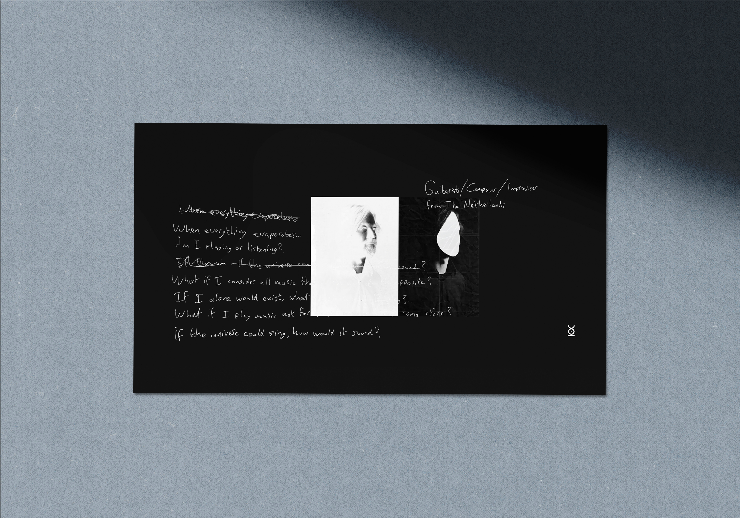
Bram Stadhouders
Dutch guitarist Bram Stadhouders is a trailblazing composer and innovating improvisor, who is consistently exploring the boundaries ambient electronic, jazz, classical and global music.
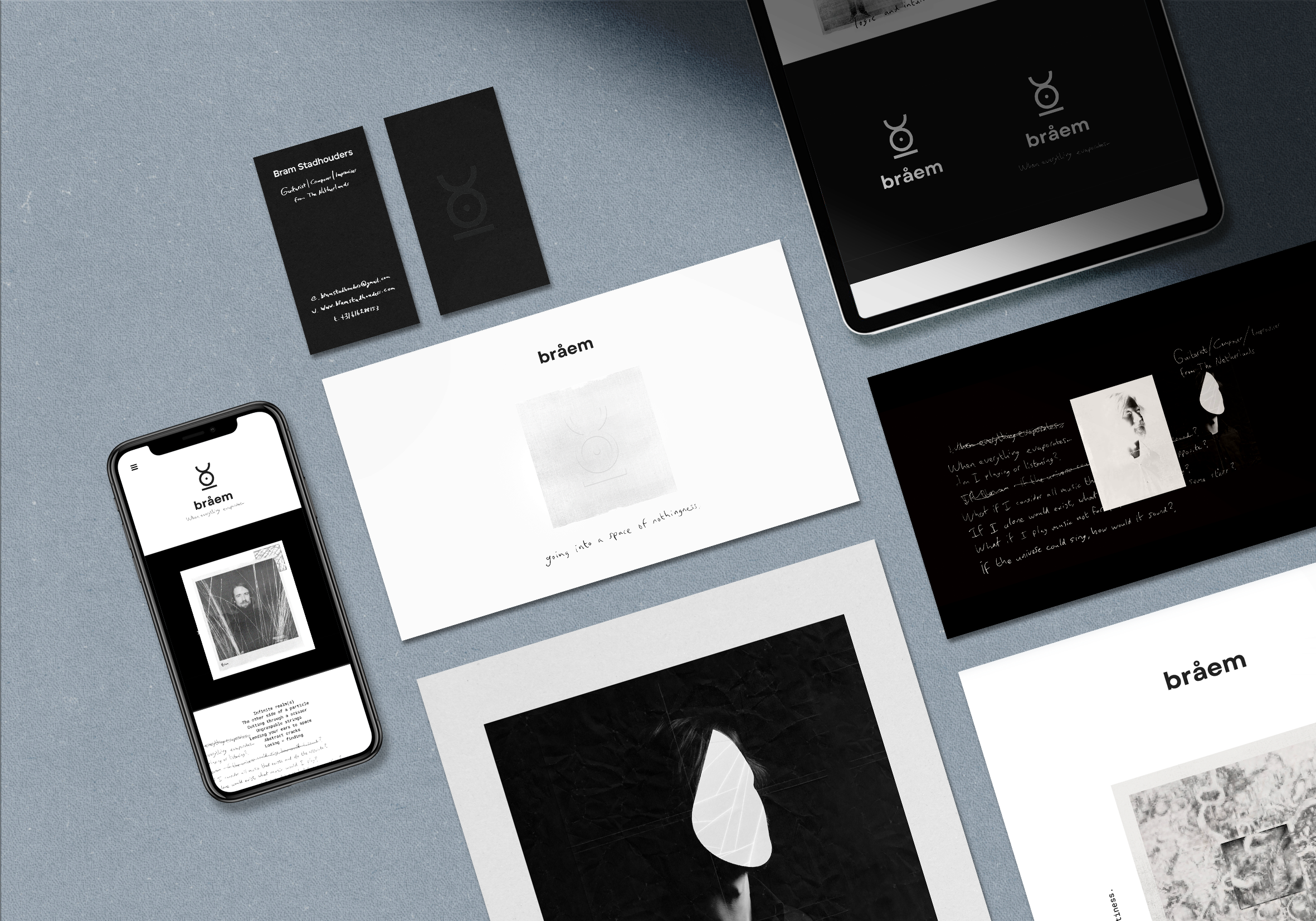
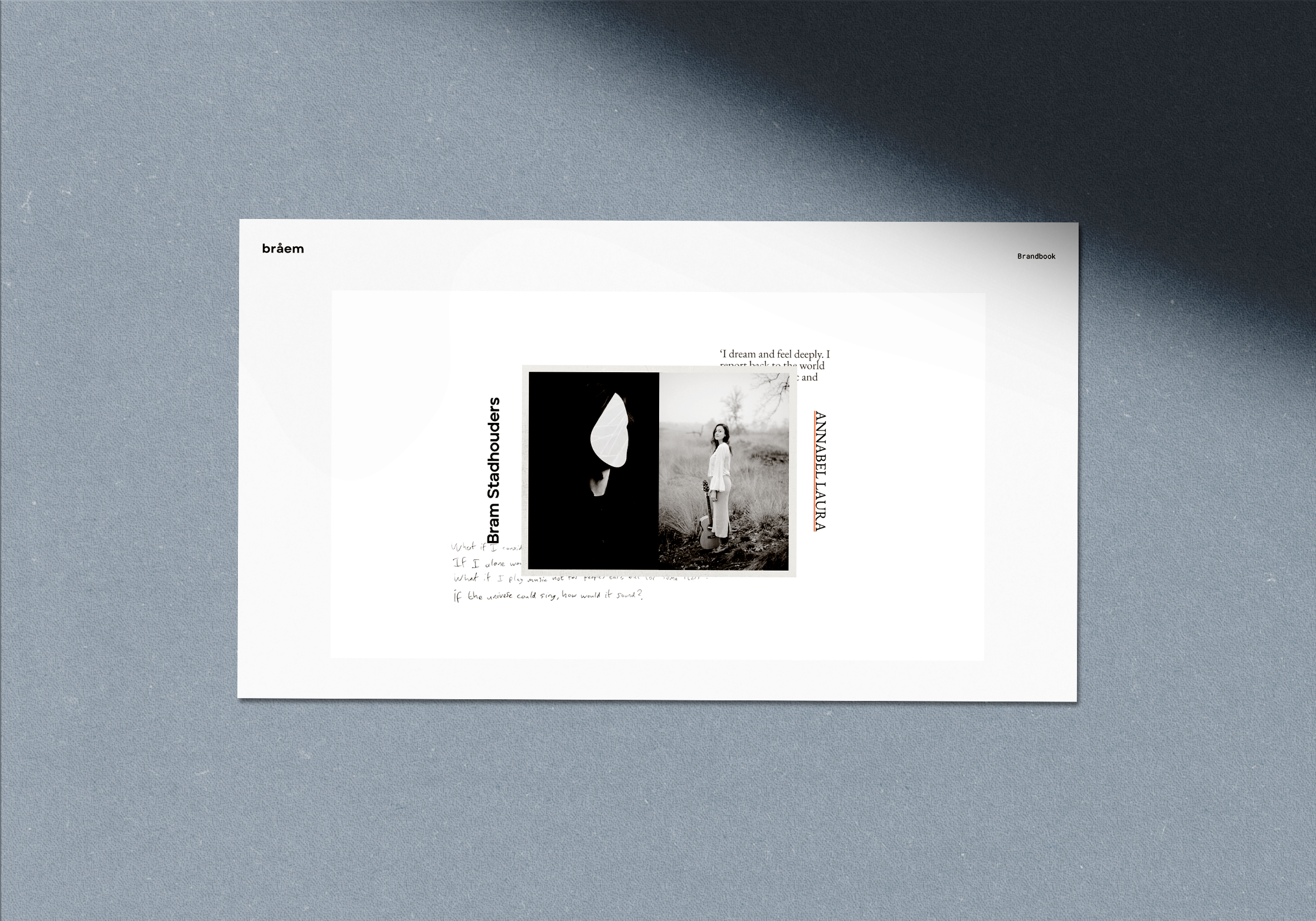
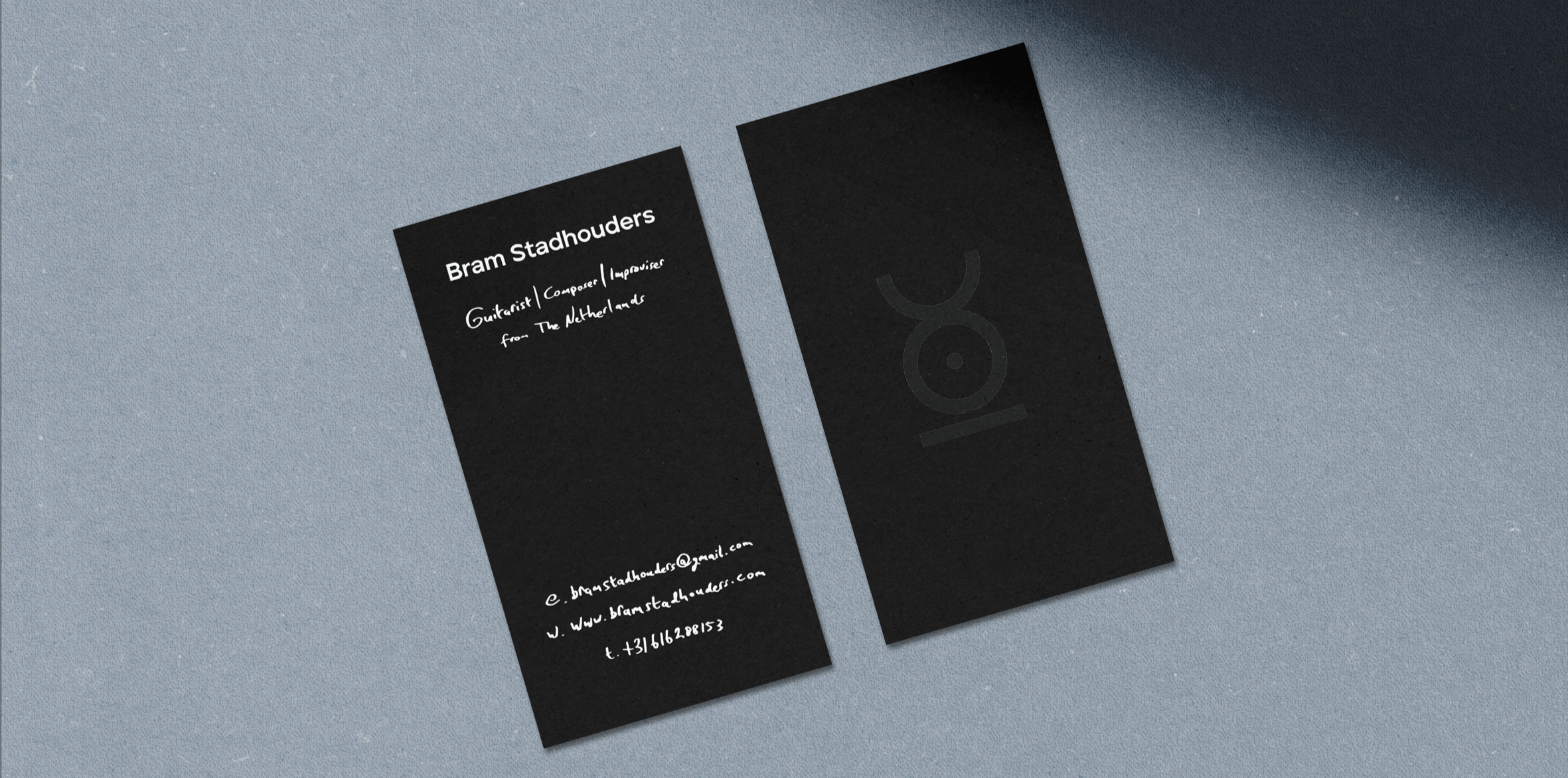
Visual identity, scenography, fabric and website design.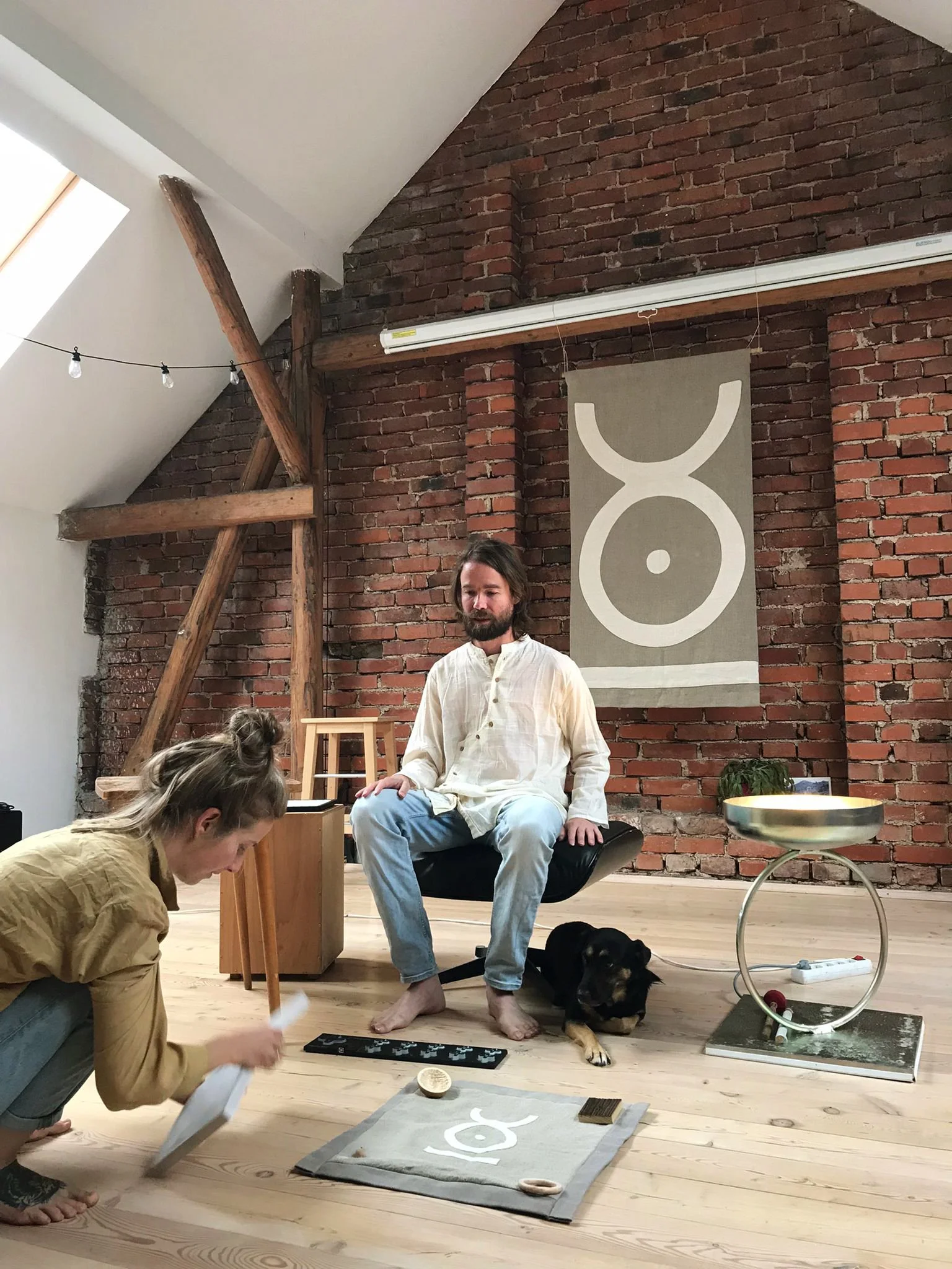
Bråem is a brand run by musician Bram Stadhouders.
He is a Dutch guitarist, trailblazing composer, and innovating improviser who consistently explores the boundaries of ambient electronic, jazz, classical, and global music. The branding focused on showcasing his multifaceted nature. It encompasses elements related to the:
subjectivity of his musical choices (handwritten script, paper textures),
his spiritual quest (emptiness, white space, face covering)
experimental nature of his music (technical font, simplicity of layouts)
the boldness of his choices and cooperations (minimalistic, symbolic logo)
We’ve spent four days together diving into - what, who and why Bråem really is.
Working on the branding was an exploration of the journey Braem Stadhouders's work takes from its inception, through the birth of an idea, to the fluid response and dialogue with the audience during a performance.
Starting point: CRYING FOR MERGING
Invitation: TO BE
Intention: FORGETTING EVERYTHING
Qualities: SILENCE AND EMPTINESS
Path: FROM UNKNOWN TO GOING NOWHERE
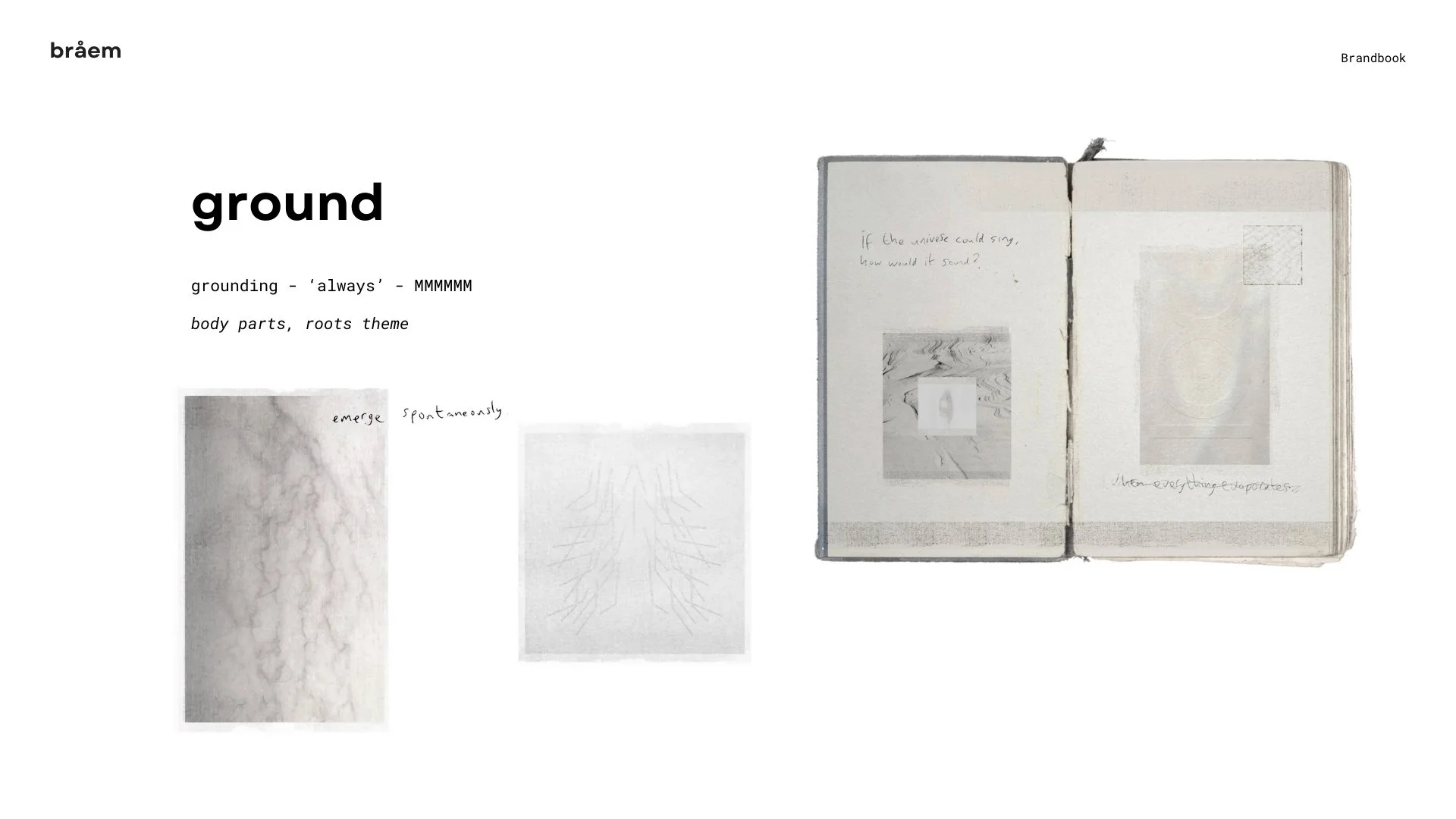
Aim: GROUNDWORK
Four main qualities of the work.
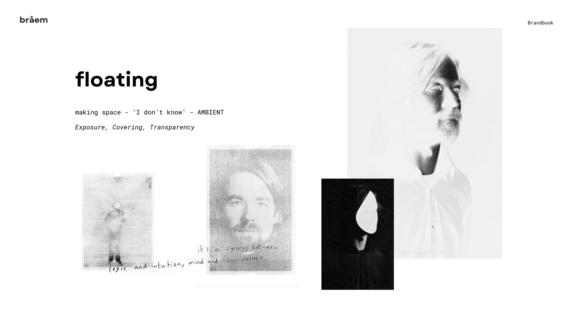
While working on the branding, we explored four main states and qualities of Bråem’s work that could be explained with specific name, action, word and sound:
GROUND | grounding | ‘always’ | MMMMMM
FLOATING | making space | ‘I don’t know’ | AMBIENT
STEADY | merging | ‘I know’ | RHYTHM
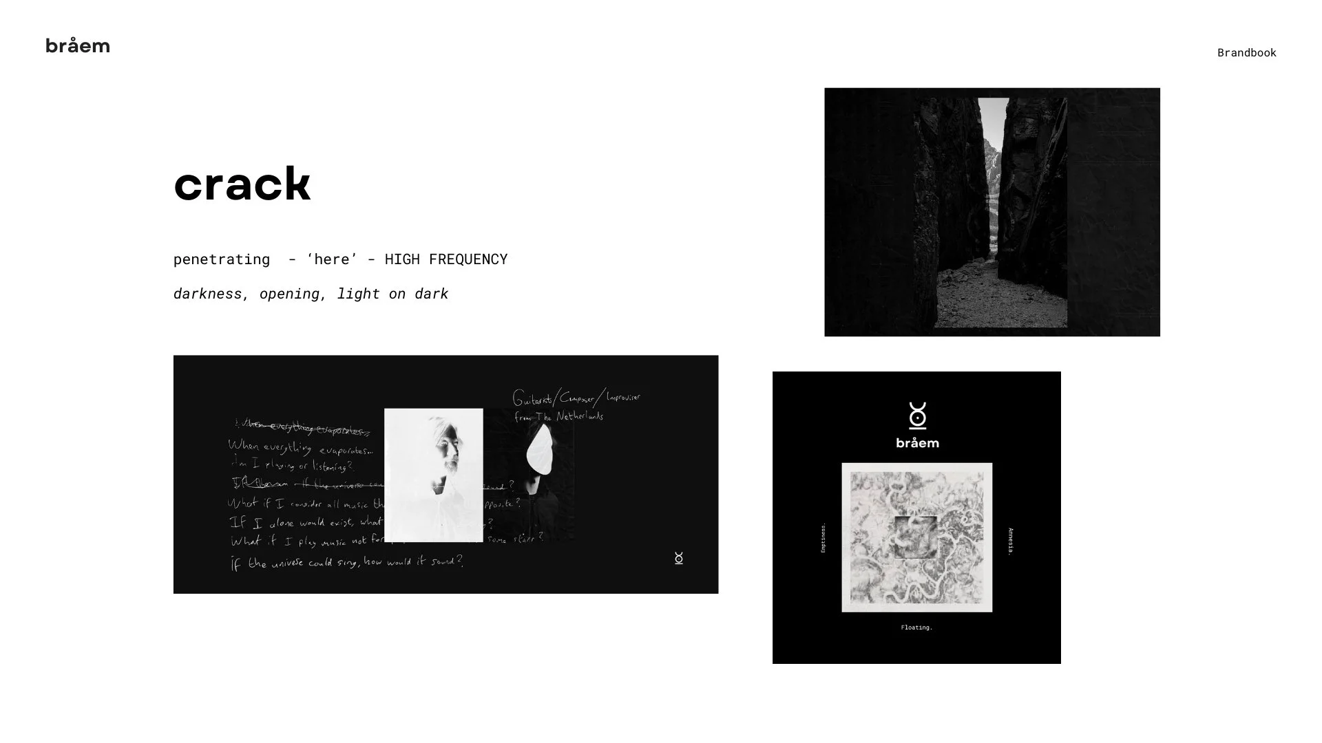
CRACK | penetrating | ‘here’ | HIGH FREQUENCY
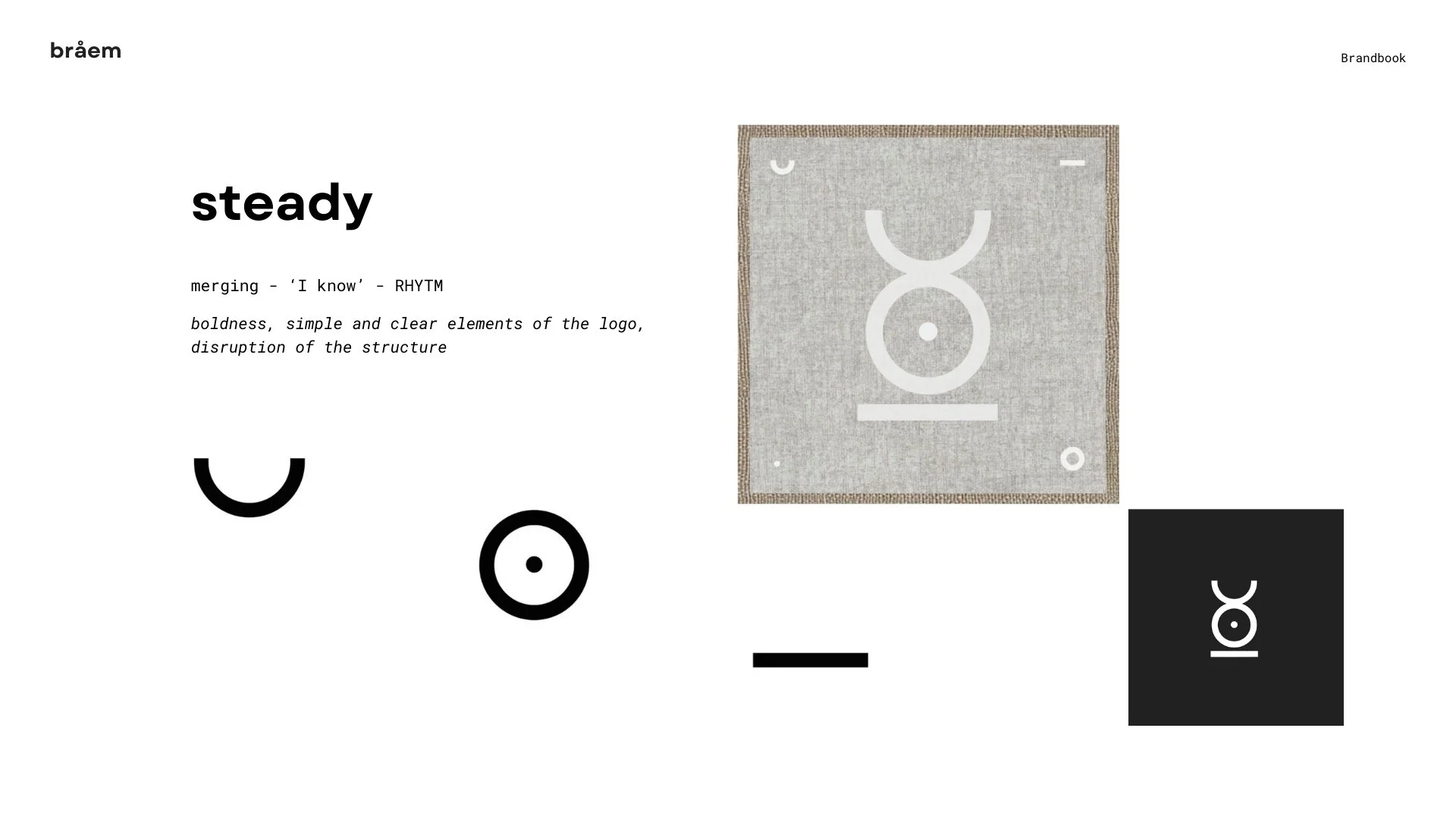
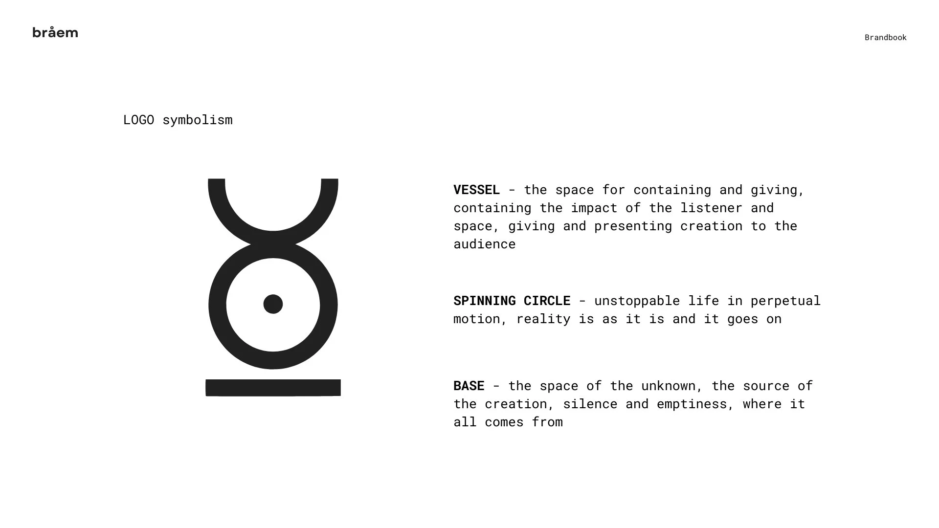
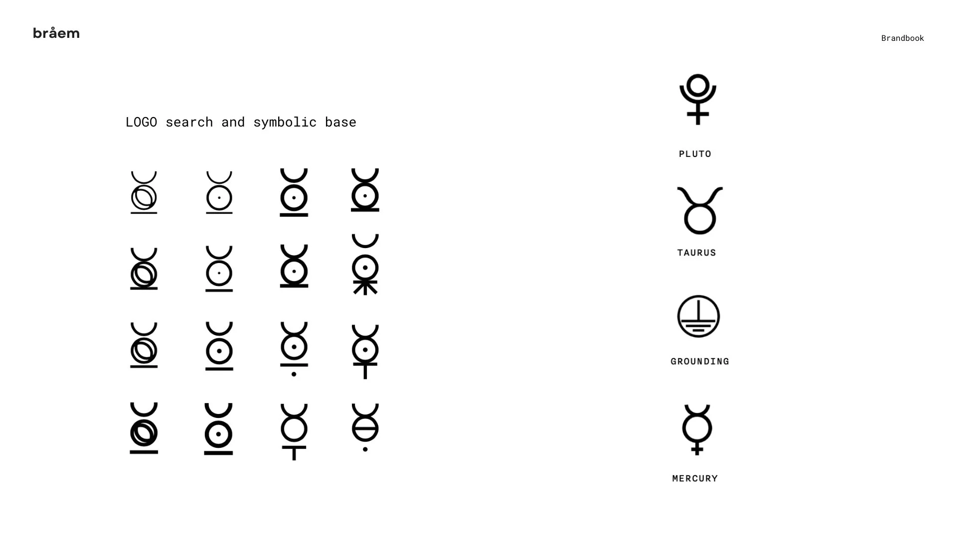
Logo symbolism
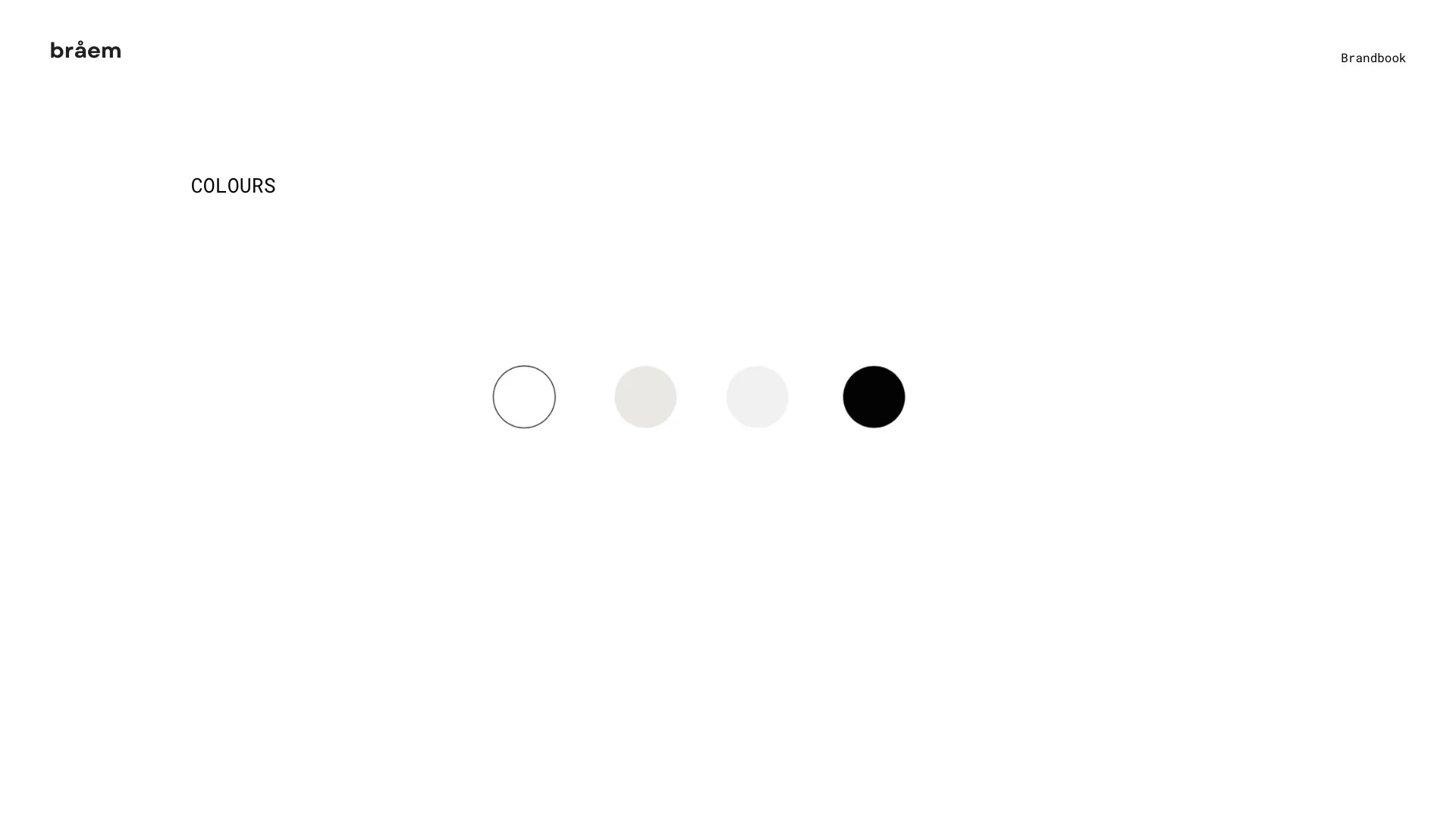
Main principles for the visual layer.
beauty of simplicity
reflecting nature
clean multiplication
endless possibilities
white space
white room
empty table
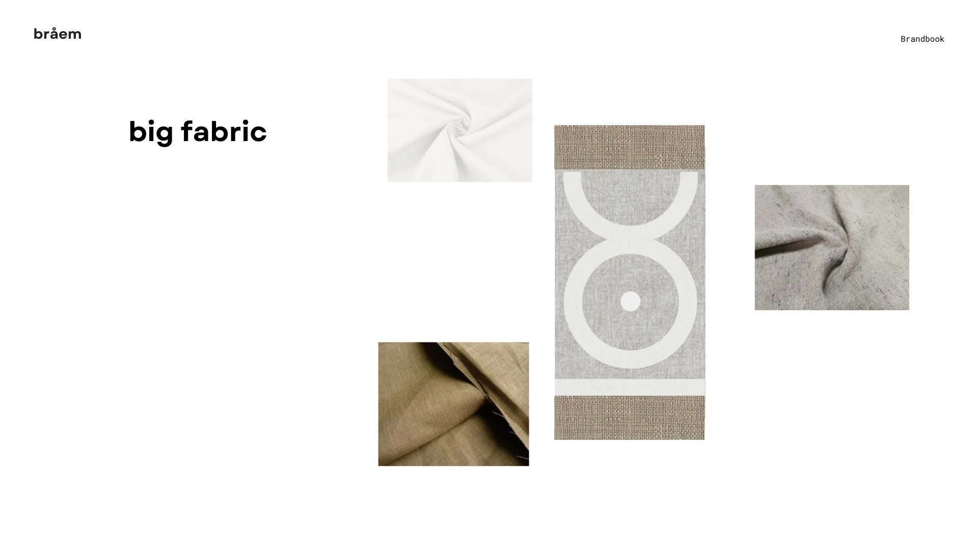
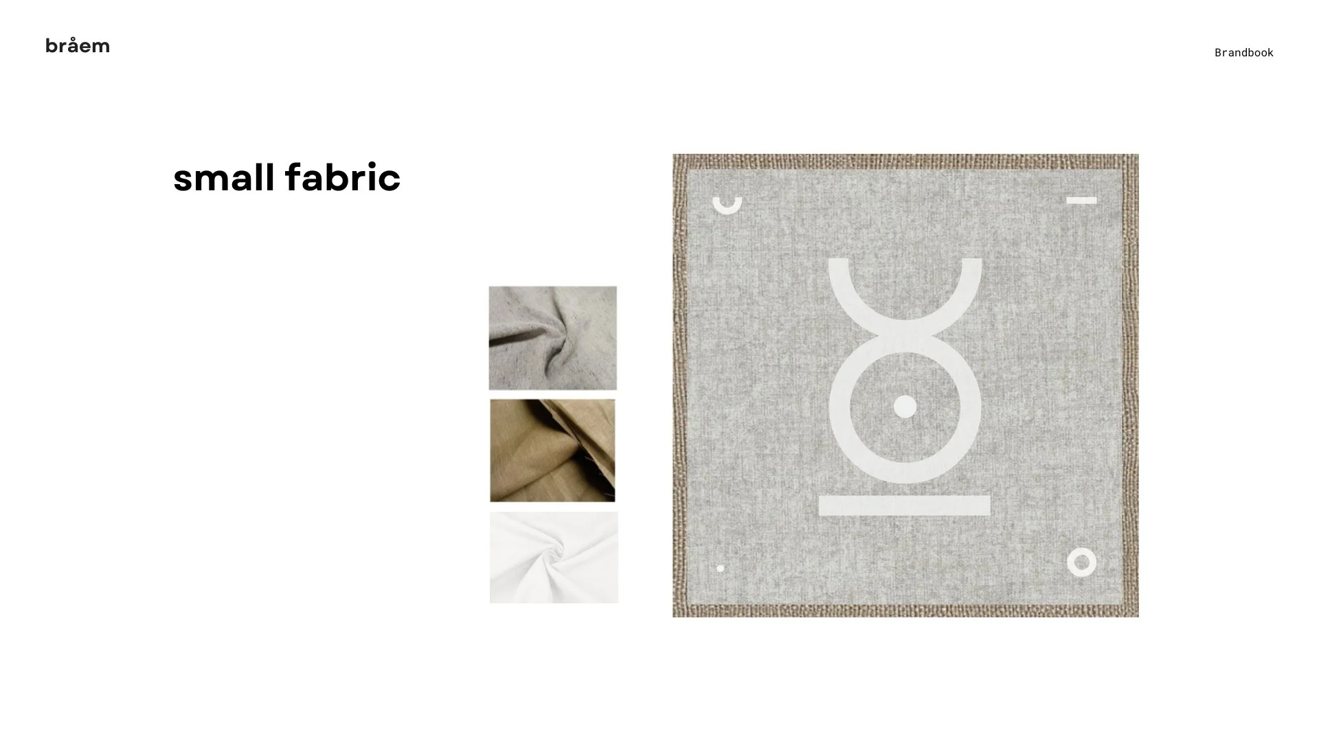
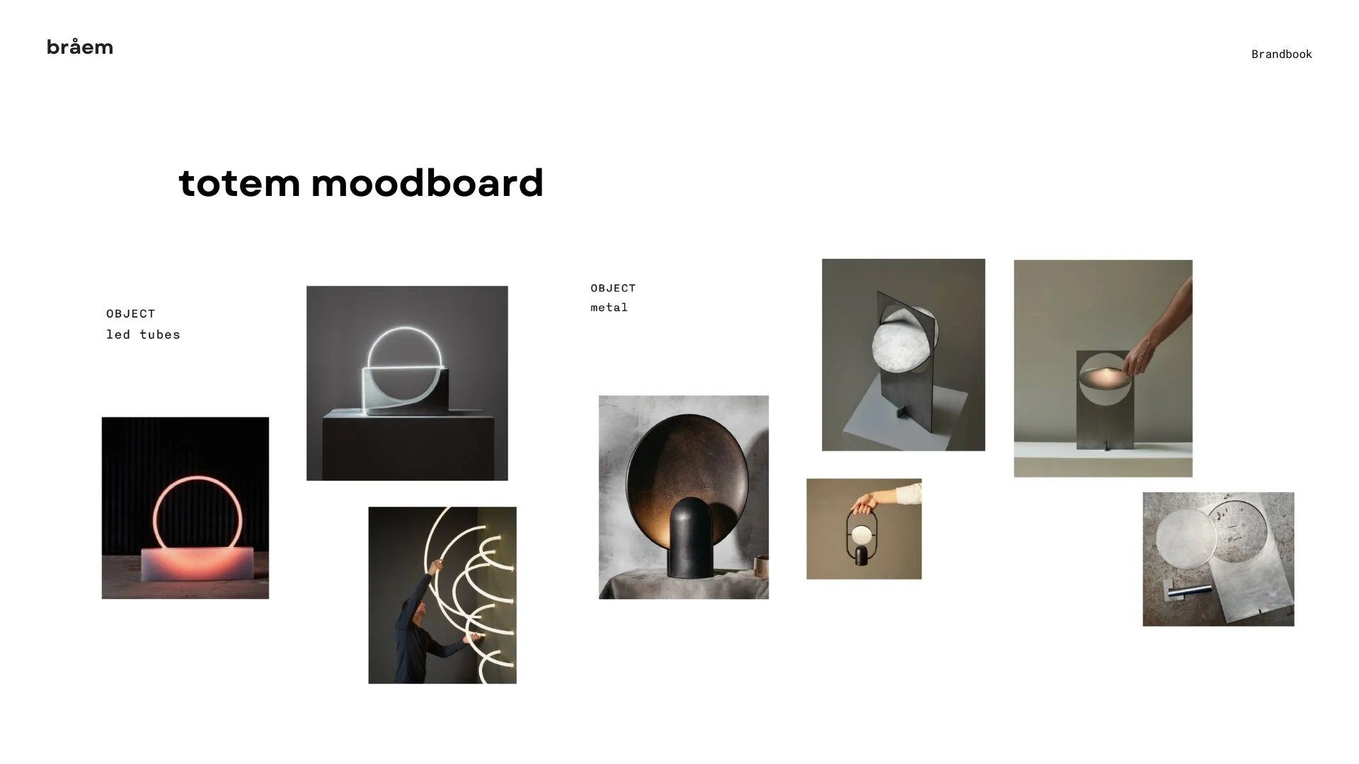
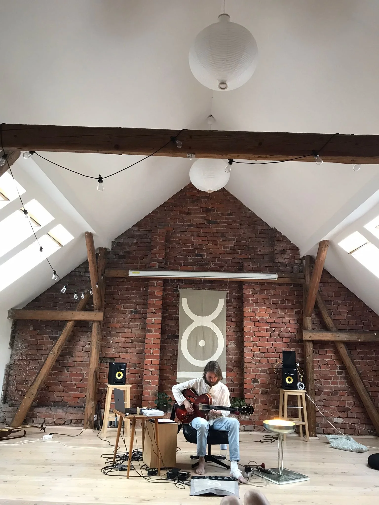
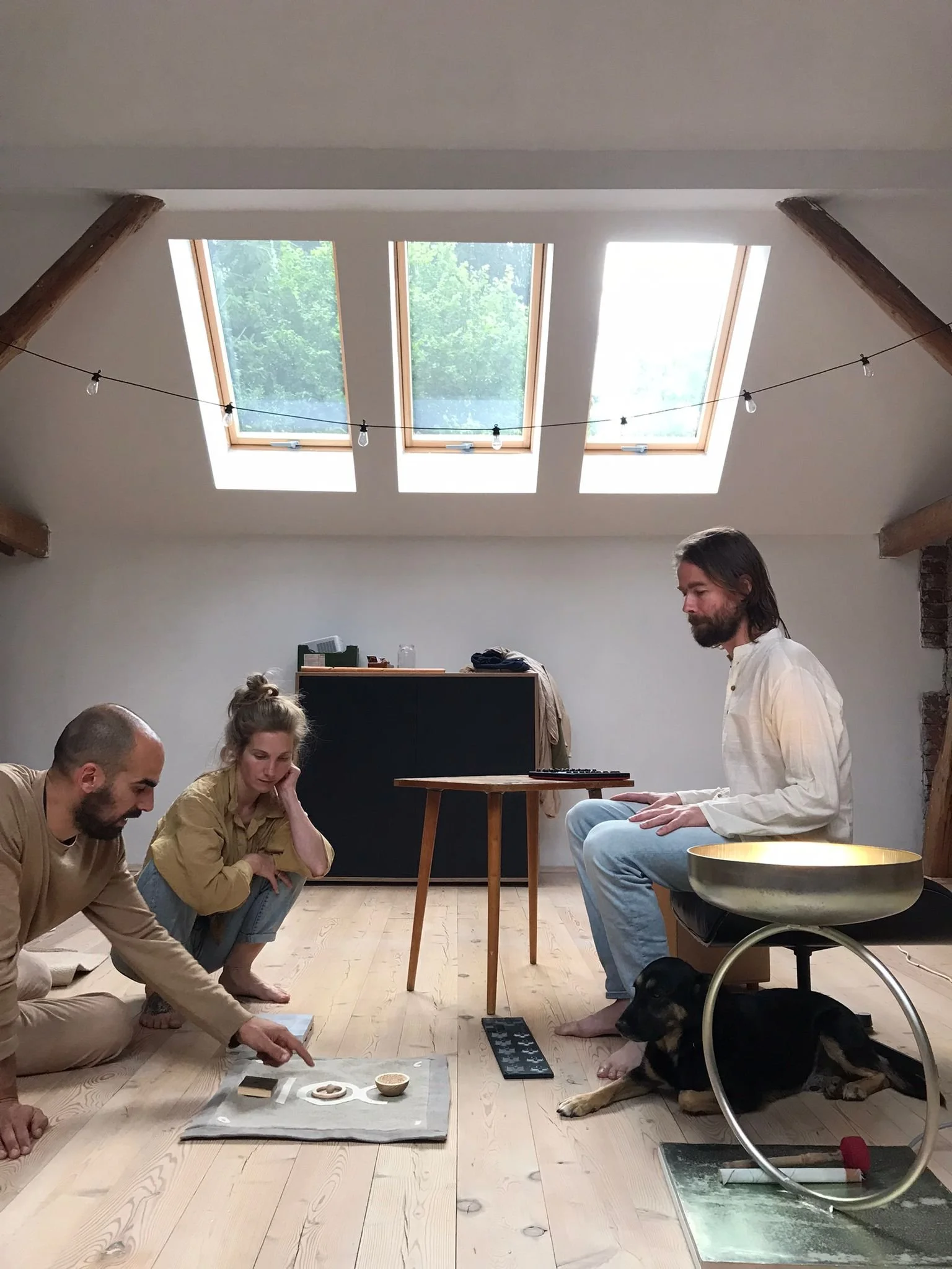
Scenography - ritual fabrics and totem
Part of the project was designing the scenography - including two ritual fabrics and a totem, playing a part in the artist’s performance.